Partner Portal — Product Design RedesignFrom integration-obsessed to user-centred: rebuilding Movinghub’s Partner Portal into a scalable product and introducing the company’s first design system.
Role: Lead Product & UX/UI Designer (sole designer, no project manager)
Duration: 6 weeks · End-to-end delivery before Christmas
Tools: Figma Make (AI) · Figma · FigJam · CSS · Bootstrap 5 · FontAwesome 6
Stakeholders: Product Director · Sales Team · Developers · Shareholders
Users: Property Managers · Agency Directors · Senior Partners
Background & Challenge
The Partner Portal allows property managers to add customers, manage service connections, and generate extra revenue.
Before I joined, it had been built entirely by developers — with no UX process, no design files, and no design system.
The product showcased internal integrations rather than supporting users’ daily tasks.
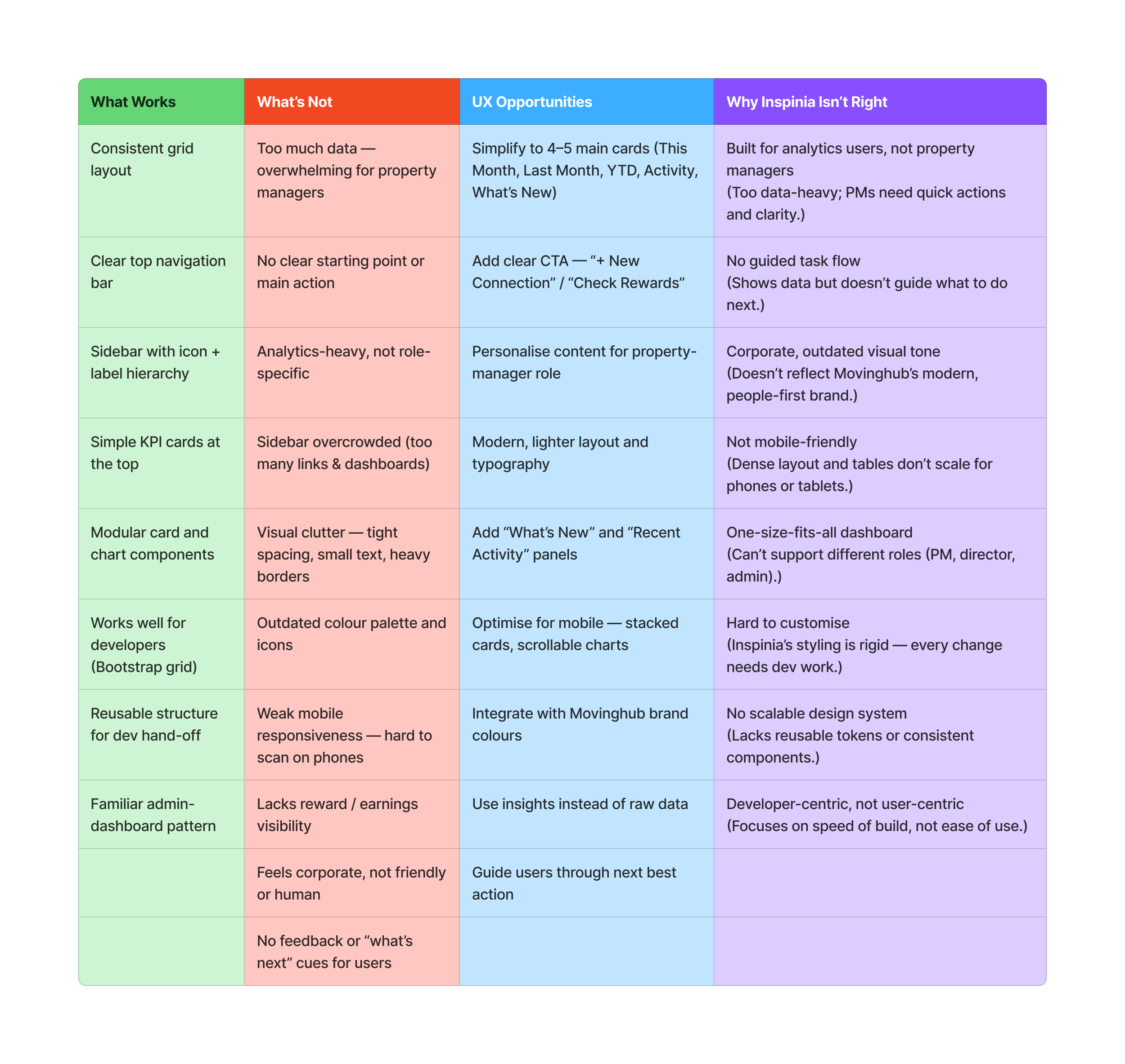
Key issues
Portal focused on integrations instead of user workflows
Core tasks such as “Add Customer” were confusing or hidden
Long, inconsistent mobile experience
Unclear terminology and data presentation
Property managers stopped using the portal or moved to competitors
Leadership wanted a full relaunch within six weeks
Gaps & opportunities of the project
Approach
With no project manager or existing design resources, I created my own roadmap and milestones.
This became a complete product-design rebuild — balancing research, UX strategy, stakeholder education, and the creation of a reusable design system.
1. Research & Discovery
Methods
• User interviews and usability testing with property managers and directors
• User-flow analysis to identify friction and inefficiencies
• Competitor benchmarking (MyConnect, Compare & Connect, YourPorter)
• Pain-point mapping and journey visualisation in FigJam
Findings
• Users wanted clarity and speed, not complex integrations
• Metrics like “This Month / Last Month / YTD” were confusing
• Terminology (“Lead”, “Customer”, “Connection”) was inconsistent
• Navigation lacked hierarchy and purpose
Outcome
Shifted focus from showing integrations to making everyday work faster and clearer.
2. Stakeholder Engagement & Education
Because UX was new to the company, I ran two major shareholder workshops to align expectations and introduce iterative design.
Workshop 1 – Discovery & Alignment
Introduced the UX process and its business value
Shared research insights to re-centre goals around users
Defined roles between design, content, and development
Workshop 2 – Prototype Review & Buy-in
Presented functional prototypes to demonstrate flow
Clarified that initial layouts focused on functionality, not final visuals
Explained UX familiarity vs. IP duplication and showed how standard patterns help users learn faster
After confirming functionality, I produced three distinct layout directions; stakeholders liked all, and together we selected one to refine
These sessions helped the team understand iteration, design rationale, and ethical, user-centred design.
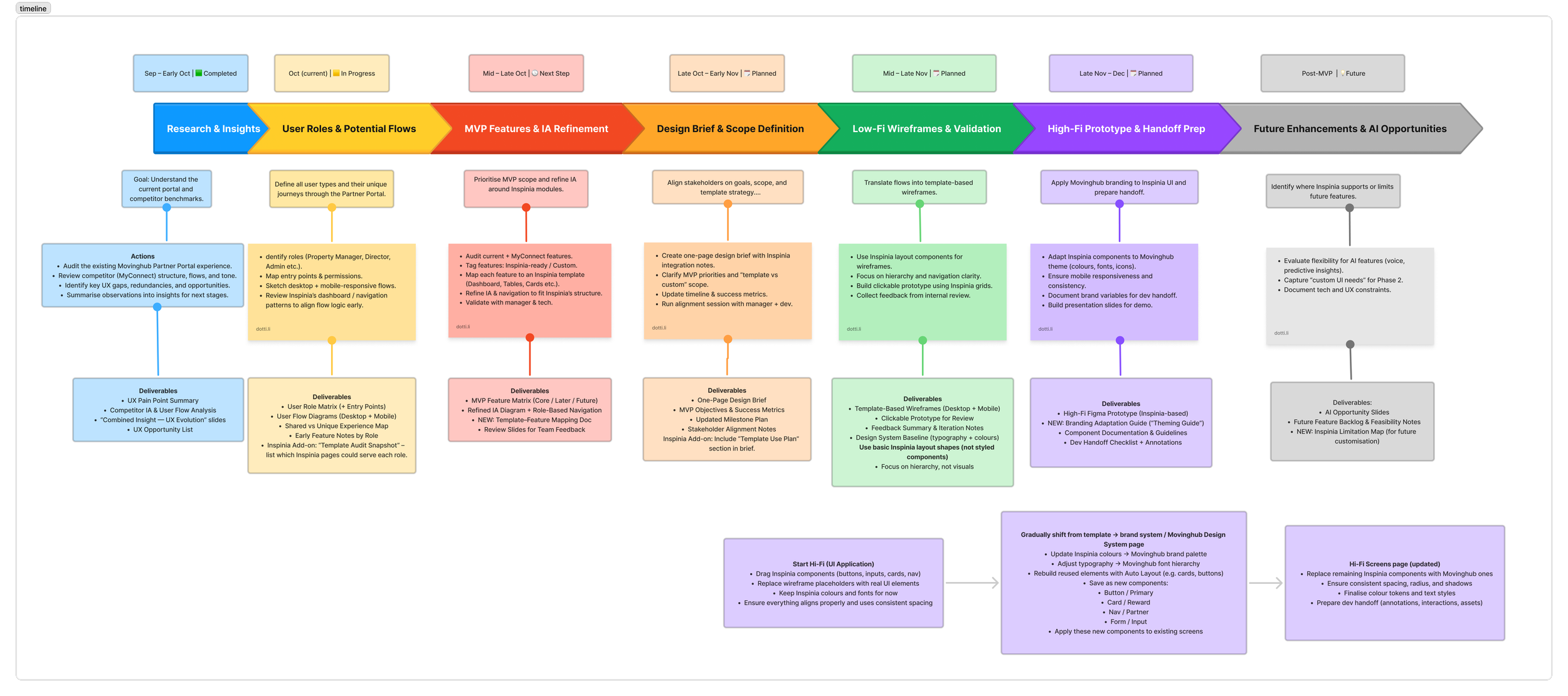
Timeline of the project
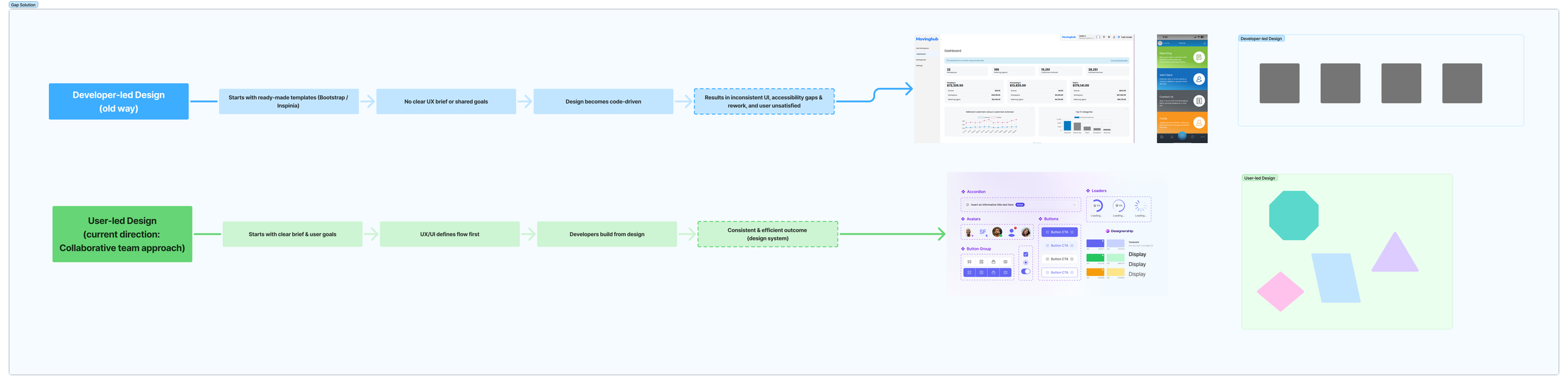
Stakeholder workshop: understanding previous work flow (developer-led) vs current work for (user-led)
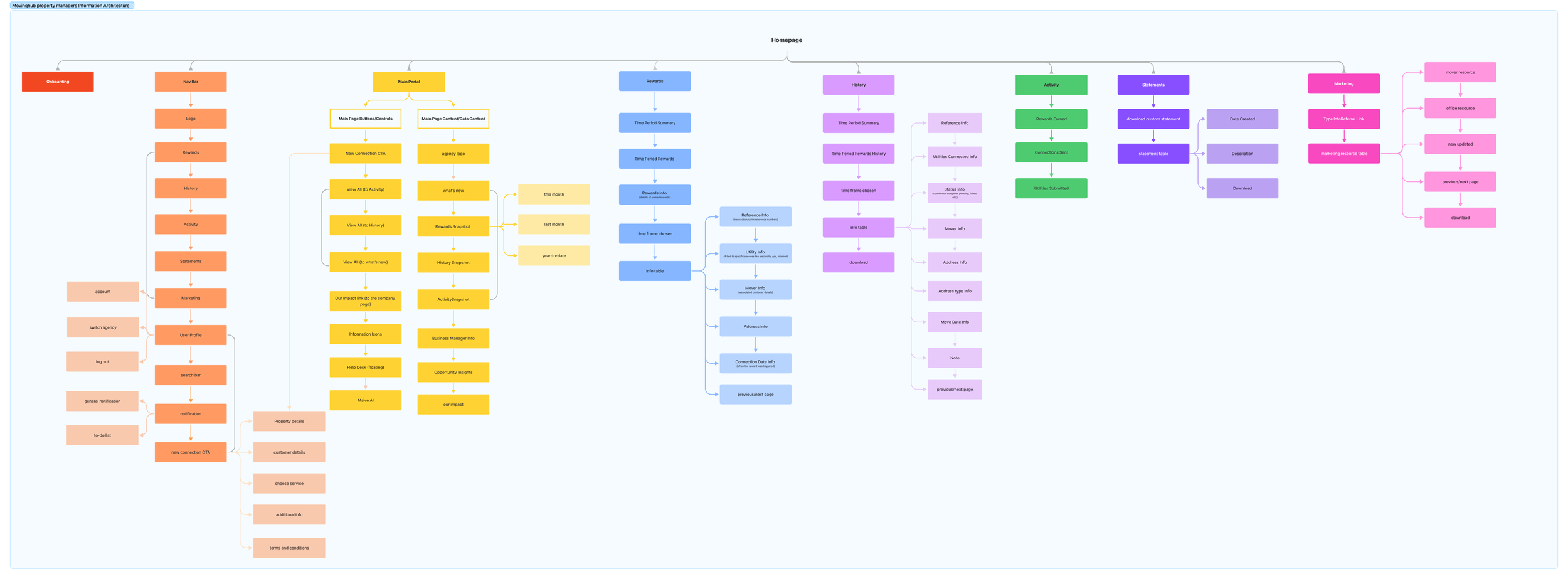
Information architecture of the new portal
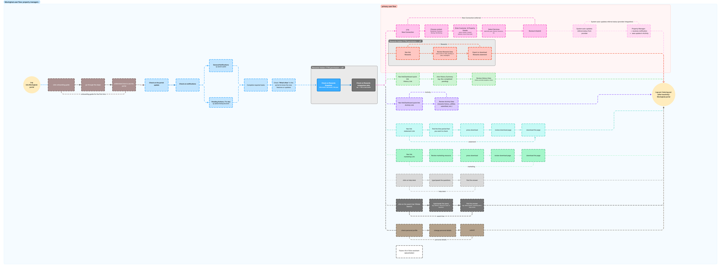
User flow - property manager of the new portal
3. Constraints → Innovation
Initially restricted to rigid Bootstrap 5 templates, I looked for faster, more flexible solutions.
Action
Self-trained in Figma Make (AI) within one week
Built a Bootstrap-compatible design system in Figma Make and implemented it in CSS
Maintained brand consistency while improving accessibility and structure
Taught developers to use Figma Make for collaborative hand-off
Once proven efficient, the workflow was adopted company-wide
Result
• ~50 % faster iteration cycle
• Unified components mapped directly to Bootstrap CSS
• Improved collaboration between design and engineering
4. Information Architecture & User Flows
Dashboard
├── Customers
│ ├── Add Customer
│ ├── Manage Customers
├── History
├── Rewards
├── Marketing
├── Training
└── Profile & Notifications
Rationale
Prioritised daily workflows
Reduced cognitive load
Created scalable navigation for future modules
5. Design Development
Design Iteration in Figma Make
As the sole designer, I combined creative direction, design execution, and critique
Designed and curated all layouts manually while using Figma Make to accelerate repetitive tasks and maintain consistency
Used AI selectively to critique layouts and explore hierarchy and accessibility improvements
Built a Bootstrap-compatible design system in Figma Make and implemented it in CSS, providing reusable, brand-aligned components
Unified typography, colour palette, and iconography (FontAwesome 6)
Simplified dashboard metrics and hero messages
Optimised responsive layouts and micro-interactions for mobile usability
• Improved collaboration between design and engineering
6. Terminology & UX Writing Alignment
Multiple terms were used inconsistently across the platform and related products — Referral, Referrals, Partner App, Customer, Connection.
This caused confusion for both users and internal teams.
Action
Audited terminology across the Partner Portal, Referrals module, and Partner App
Proposed a unified glossary and tone of voice
Collaborated with a shareholder to approve consistent language
Created a content matrix documenting final terms
Key terminology decisions:
Referral / Referrals → Standardised to Referrals (plural) for data-list consistency.
Partner App → Unified as Partner Portal across all touchpoints.
Customer → Replaced “Lead” and “User” to clearly identify end customers.
Connection → Standardised as Service Connection to clarify analytics and process language.
Partner → Replaced “Agent” and “Director” for a unified experience across roles.
These changes were documented in a shared content matrix and adopted by design, development, and marketing teams.
7. Project Timeline
Week 1 – Research & Audit
User interviews, pain-point mapping, and user-flow analysis.
Week 2 – Information Architecture & System Setup
Rebuilt navigation and initial component structure.
Week 3 – High-Fidelity Prototypes
Created responsive desktop and mobile designs in Figma Make.
Week 4 – Workshops & Feedback
Presented iterations and aligned stakeholders.
Week 5 – Terminology & UX Writing
Developed the content matrix and unified terminology.
Week 6 – Visual Polish & Handover
Delivered final Figma Make + CSS design system documentation.
Project management of the project
8. Final Design
Highlights
Modern, structured dashboard showing only relevant data
Fully responsive Bootstrap 5 + CSS design system built in Figma Make
Consistent typography, spacing, and iconography across four user types
Unified experience reflecting brand identity
Design system adopted for other Movinghub products
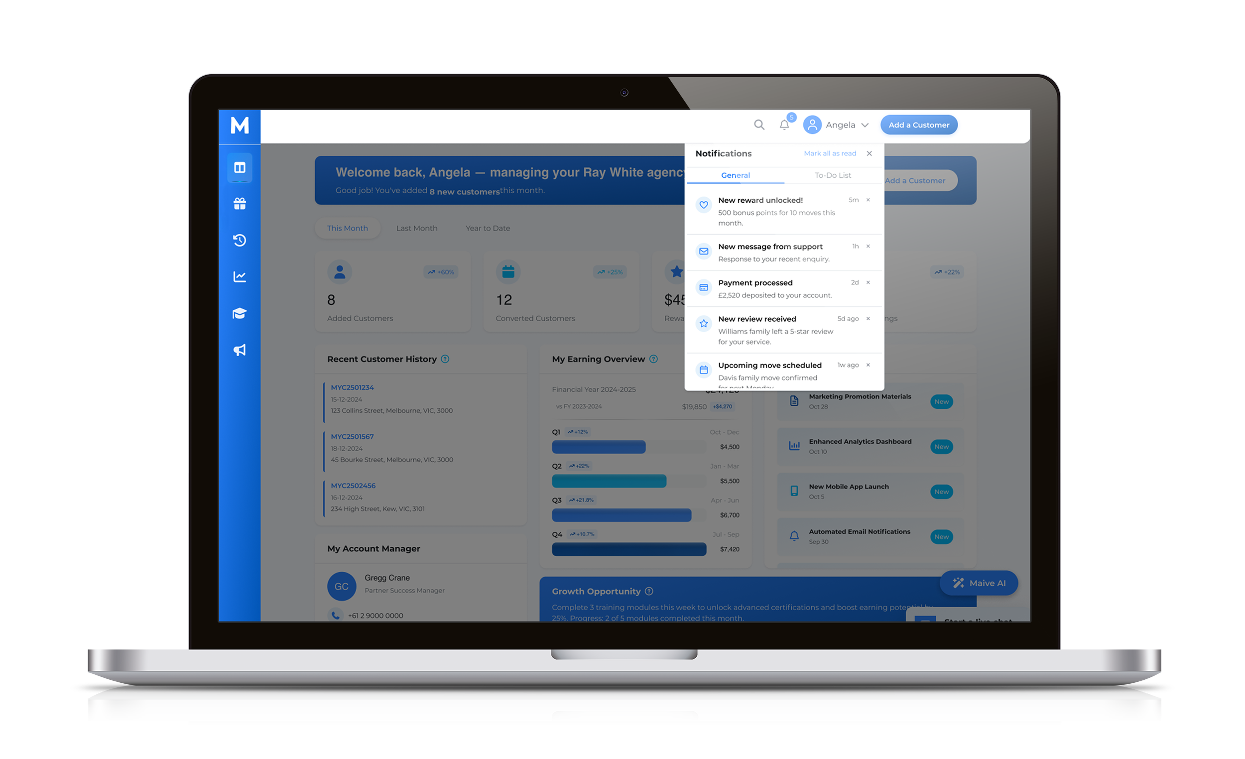
Final design of the portal
9. Impact & Outcomes
Delivered four responsive portal versions within six weeks
Created the company’s first scalable design system, built in Figma Make + CSS
Trained developers to use the new system for faster collaboration
Improved workflow efficiency and design-to-dev accuracy
Shifted the product from integration-focused to user-centred
Strengthened clarity, usability, and partner trust
10. Next Steps
Conduct post-launch usability testing to measure adoption and efficiency
Extend the design system across new products
Introduce analytics-driven UX improvements