
ARCHMATERIA— A curated platform for architectural material discovery
Role: Founding Product & UX/UI Designer · Brand Strategy & Identity
Duration: Ongoing project
Platform: Responsive Marketplace Platform Desktop · Tablet · Mobile Focus: Product Discovery · Brand Identity · UX/UI Design · Information Architecture · Usability Testing · Design System
Tools: Figma · FigJam · Figma Make · Figma Agent · Adobe Creative Suite · AI-assisted Workflows
Project Overview
ArchMateria is a bilingual B2B platform connecting architects and design professionals with architectural material manufacturers. It combines visual discovery, detailed product information and enquiry workflows, allowing users to explore, evaluate, save and request materials.
Its long-term vision includes a 3D Simulation Workshop, where architects could visualise materials in architectural environments before making sourcing decisions.
As the founding designer, I led the brand and end-to-end UX/UI design while helping the founders clarify their product vision, align priorities and establish a practical first release.
01. The Challenge
Turning an Ambitious Concept into a Clear Product Direction
The founders had a strong business vision but lacked a cohesive brand and user-centred digital experience.
Their initial information architecture (IA) reflected business assumptions rather than how architects would discover and evaluate materials. Different stakeholder opinions and evolving feature requests also made it difficult to define a focused product.
Three challenges emerged:
Product Structure: Material categories, filtering and user journeys needed to reflect different sourcing behaviours.
Stakeholder Alignment: The team needed a shared decision-making framework for evaluating product priorities.
Brand & Scope: The platform needed a premium, architecture-focused identity while balancing essential sourcing features with an ambitious future 3D Simulation Workshop.
Design Challenge
How might we create an intuitive, visually inspiring materials platform that balances user needs, business objectives and delivery feasibility?
02. Discovery & Stakeholder Alignment
Establishing a Shared, User-Centred Design Process
Rather than moving directly into UI design, I facilitated collaborative stakeholder workshops to clarify business objectives, explore user needs and introduce a more structured approach to product decision-making.
I used personas and user journey mapping to demonstrate how architectural professionals might discover, evaluate and request materials. Competitive benchmarking helped inform the platform's navigation and discovery patterns.
From Assumptions to User Needs
The workshops revealed that the biggest UX challenge was structural rather than visual.
The initial categories and filtering hierarchy did not sufficiently reflect different users' goals. I revisited the information architecture with stakeholders, connecting the key stages of discovery, evaluation and enquiry.
Personas and user journeys became shared references when discussing new features and resolving differing opinions.
Outcome
The process helped establish a collaborative, user-centred approach to decision-making and provided a clearer foundation for the product's structure and priorities.
04. Designing Material Discovery
One Platform, Different User Needs
Through personas and stakeholder discussions, I identified two important discovery behaviours.
● Exploratory Discovery
Architects and designers seeking inspiration and new materials, prioritising imagery, intuitive categories and accessible browsing.
● Specification-Led Evaluation
Professionals making or influencing material decisions, needing detailed attributes, manufacturer information and efficient filtering.
My Design Approach
Restructuring Material Categories
I organised the material taxonomy around clearer relationships between categories, subcategories and product attributes.
● Progressive Filtering
The Materials Gallery supports visual browsing and specification-led evaluation, allowing users to narrow results by material category, brand, origin and relevant properties.
● Connecting Discovery with Evaluation
Product detail pages combine imagery, specifications and manufacturer information. Manufacturer profiles and Industry Voices provide additional context beyond the catalogue.
Outcome
Rather than separating users into different experiences, the revised structure supports a progression from visual inspiration to focused material evaluation within the same platform.
06. Brand Strategy & Bilingual Experience
From an Early Business Concept to ArchMateria
The founders initially used the working name XX2XX, which did not fully reflect their ambition to attract architectural professionals and premium commercial partners.
Following discussions about the intended audience and positioning, I proposed ArchMateria, connecting architecture and materials in a more distinctive, industry-relevant identity.
I also developed the brand tagline:
“Where digital materials meet architectural imagination.”
The resulting identity draws on architectural forms, material textures and graphic representations. I developed the logo, colour palette, typography, imagery direction and brand guidelines alongside the product's UX foundations.
Translating the Brand into UI
The interface combines material-led imagery, editorial typography and considered layouts with structured information and functional interactions.
For English, I selected Analogue for headings and Inter for body text, with Avenir used in the logo.
For Chinese, I paired Noto Serif SC with Noto Sans SC to maintain a related visual character across writing systems.
Localisation Beyond Translation
The Chinese and English versions share the same product architecture but adapt selected interactions for each market.
Chinese: WeChat, mobile verification and email authentication, with WeChat-based support.
English: Email-based authentication and a contact form with validation and confirmation states.
I also developed responsive layouts across desktop, tablet and mobile, adapting navigation, filtering, forms and content hierarchy.
Outcome
The project established a cohesive brand and bilingual product experience designed for architectural professionals across languages and devices.
08. Project Outcomes
● Brand & Product Direction
Established the ArchMateria brand identity and helped the founders define a phased product strategy.
● Stakeholder Alignment
Introduced collaborative workshops, personas and user journeys to support more informed product decisions.
● UX & Product Design
Restructured the material taxonomy, developed filtering logic and designed connected discovery-to-enquiry workflows.
● Bilingual Delivery
Delivered high-fidelity Chinese and English interfaces across desktop, tablet and mobile, supported by a lightweight design system and developer handoff documentation.
AI-Assisted Design Workflow
I used Figma Make and AI-assisted design tools for interactive prototyping, consistency reviews and design iteration.
I was also invited to present this workflow at a Figma AI event, sharing how emerging tools supported the design process.
Reflection & Next Steps
ArchMateria reinforced the importance of establishing shared product understanding before detailed interface design.
As the founding designer, I connected business positioning, stakeholder needs, UX strategy and visual design while balancing an ambitious vision with practical delivery priorities.
The next opportunity is to research and prototype the 3D Simulation Workshop, exploring how spatial visualisation could connect with architectural material sourcing.
03. Product Strategy & MVP
Prioritising What Matters First
One of ArchMateria's key differentiators is its proposed 3D Simulation Workshop, where architects could visualise materials in architectural environments and potentially request products directly from the simulation.
However, this feature required further user research, interaction exploration and technical validation.
As the founders explored new ideas, I helped evaluate features against user value, the core sourcing journey and implementation complexity.
I recommended prioritising the essential discovery and enquiry experience while moving the Simulation Workshop into a future phase. The founders agreed.
● Phase 1: Core Platform
Materials Gallery, filtering, material details, manufacturer profiles, industry content, Saved Materials, enquiries, account management and bilingual responsive interfaces.
● Future Phase: Simulation Workshop
Research, prototype and validate spatial material visualisation, then explore its integration with the sourcing journey.
Outcome
This decision established a more focused first-release scope while preserving the platform's longer-term vision.
05. Connecting Discovery to Enquiry
Designing the End-to-End Sourcing Journey
Architects often need to explore several materials before requesting more information. I designed a connected, end-to-end sourcing journey that supports this process:
Browse → Filter & Evaluate → Save Materials → Complete Request → Submit → My Applications
Key Design Decisions
Explore Before Signing In: Users can browse materials without creating an account, reducing barriers to discovery.
Save Before Enquiring: Users can collect and review multiple materials before submitting a request.
Authentication When Needed: Login and registration are introduced within relevant account-related workflows.
Clear Interaction Feedback: Saved states, validation, removal confirmation and submission feedback provide visibility and reassurance.
Continuity After Submission: Users can return to My Applications to review submitted requests.
Outcome
The workflow connects material discovery with enquiry generation, supporting a more continuous sourcing experience.
07. Usability Testing & Outcomes
Validating the Experience with Architects
I collected usability feedback from five participants with architectural backgrounds and different levels of experience.
The evaluation focused on material discovery, saving selections and navigating the enquiry process.
Feedback was generally positive, including encouraging responses to the visual design. However, some participants were unsure where to find their submitted material requests.
Finding → Design Iteration
This revealed a gap between completing a request and understanding what happened next.
I refined the connection between Saved Materials, submission confirmation and My Applications, adding clearer guidance to make the next step easier to understand.
Stakeholder workshop: understanding previous work flow (developer-led) vs current work for (user-led)
Information architecture of the new portal
User flow - property manager of the new portal
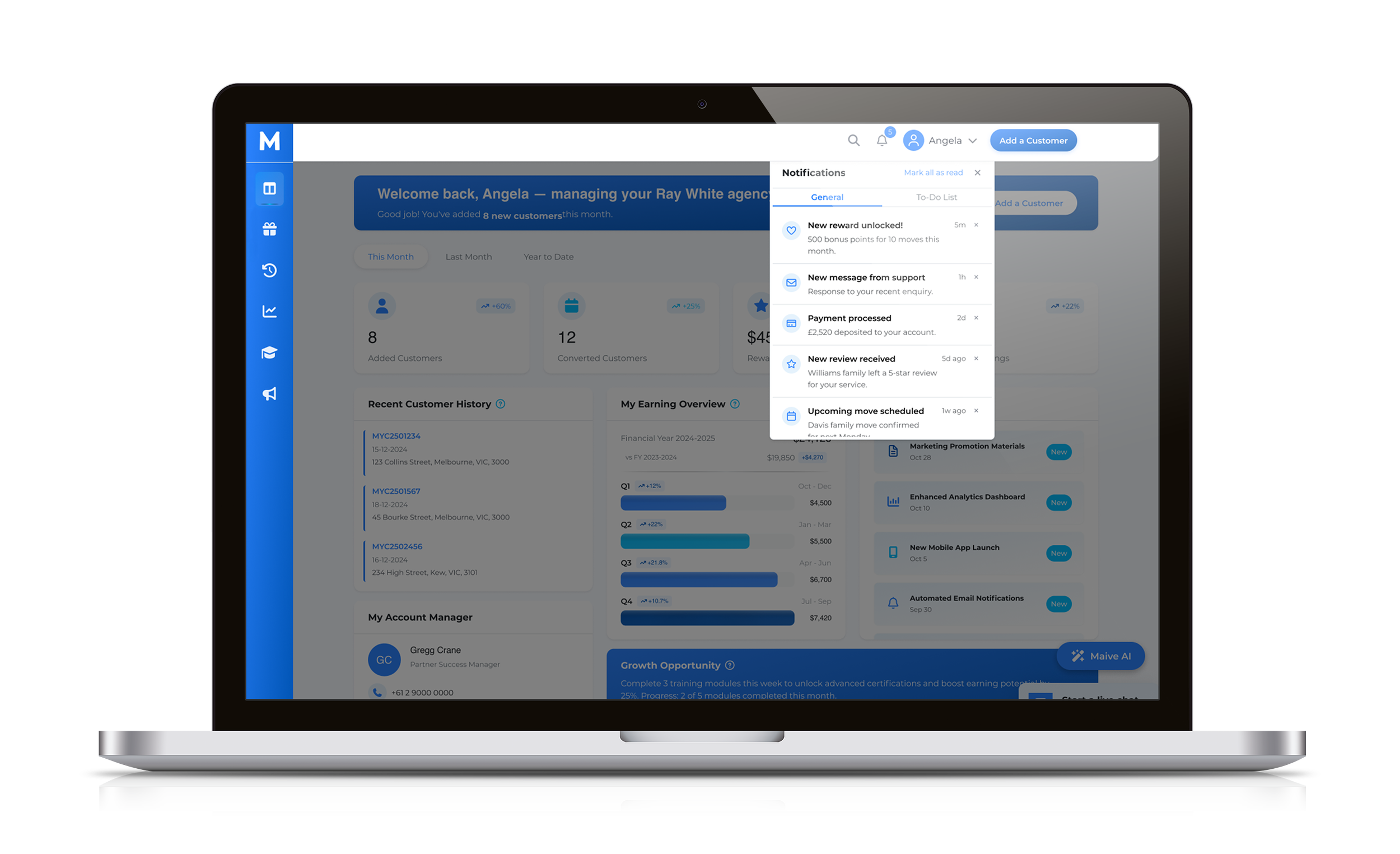
Final design of the portal