Eugene Labs — Preventative Health Landing Page RedesignRedesigning a health-tech landing page to turn confusion into clarity, fear into trust, and hesitation into confident action.
Role: Product & UX/UI Designer
Duration: 1 week
Tools: Figma Make (AI) · Figma · CSS
Stakeholders: Product Design Lead
Users: Customers who are looking for home kit testing for preventing health issues
Background & Challenge
Eugene Labs is a preventative health company offering genetic and health-risk testing services.
This redesign aimed to transform their existing landing page — which felt cold, confusing, and clinical — into a human-centred, reassuring, and easy-to-understand entry point. The goal: help potential users quickly grasp what preventative testing is, feel safe and supported, and be encouraged to take action.
Key issues
The original landing page presented several challenges:
Messaging was unclear — users couldn’t easily understand what “preventative testing” really meant.
The tone leaned toward threat or clinical heaviness, which felt emotionally heavy.
Layout felt cold and uninviting, lacking warmth and human touch.
Trust-building and reassurance signals (credibility, empathy) were weak or missing.
Primary CTAs (calls-to-action) lacked clarity and strength — potentially deterring users from proceeding.
These issues together risked alienating users who might already feel anxious about health-related topics.
Approach
UX & Content Audit: I reviewed the existing page to identify pain points: unclear messaging, intimidating tone, poor layout hierarchy, lack of trust signals, and weak CTAs.
Competitor & Market Benchmarking: I looked at how leading health-tech / preventative-health websites communicate — how they build trust, present sensitive info, and ease users into a health journey with clarity and warmth.
Information Architecture & Content Restructuring: Based on findings, I reorganised the page into a more digestible flow: from understanding “what is preventative testing” → “why it matters” → “how it works” → “why trust Eugene” → “what to do next.”
Messaging & Copy Strategy: I reframed messaging to be simple, clear, and empathetic — avoiding fear-based language and instead emphasising empowerment, clarity, and support.
Visual & UI Redesign: Using Figma, I designed a fresh, modern landing page: cleaner hero section, improved typography and layout, warmer visual tone, clear CTA buttons, and trust-building elements (testimonials, transparent process steps).
Iteration & Polish: Final refinements focused on readability, hierarchy, emotional tone — ensuring the page felt both credible and human.
Outcomes & Impact
The redesigned page transforms a confusing, clinical experience into a clear, supportive, and trustworthy landing page.
Information is easier to digest — reducing user anxiety and cognitive load when dealing with sensitive health topics.
Visual and content tone feels humane and reassuring, which increases emotional safety and user comfort.
Stronger CTAs and clearer value proposition make it more likely users will engage and consider preventative testing.
Overall — a user-centred, modern health-tech landing page that balances clarity, empathy, and conversion.
Key Improvements
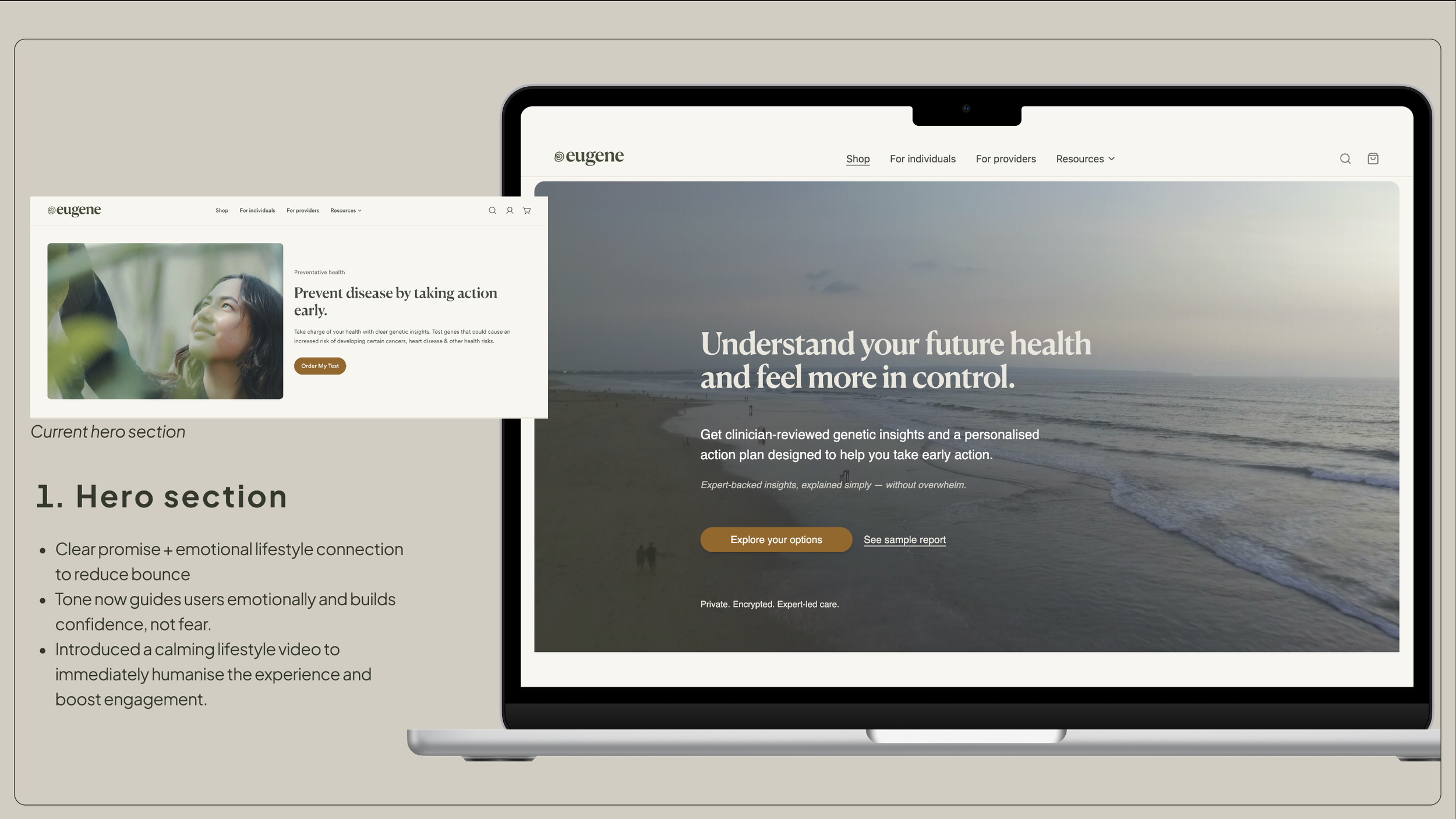
Hero Section Redesign: Clear headline + supportive subtext + standout CTA — users immediately know what Eugene offers.
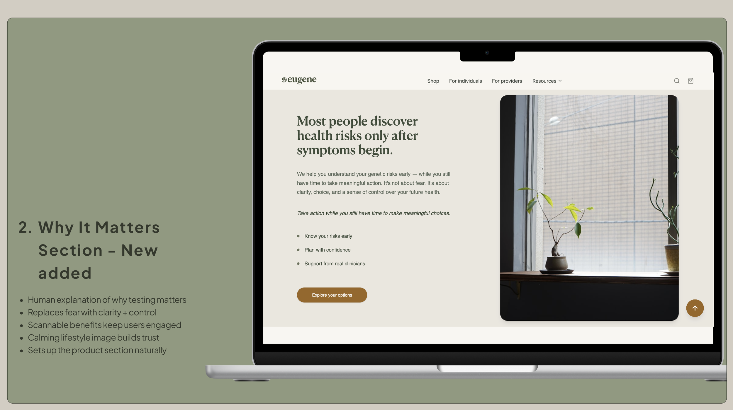
Stronger Value Proposition: Communicated exactly what “preventative testing” means and why it’s valuable — making the service more understandable and relatable.
Reorganised Content Structure: Content broken down into clear, scannable sections; users can grasp core ideas quickly without being overwhelmed.
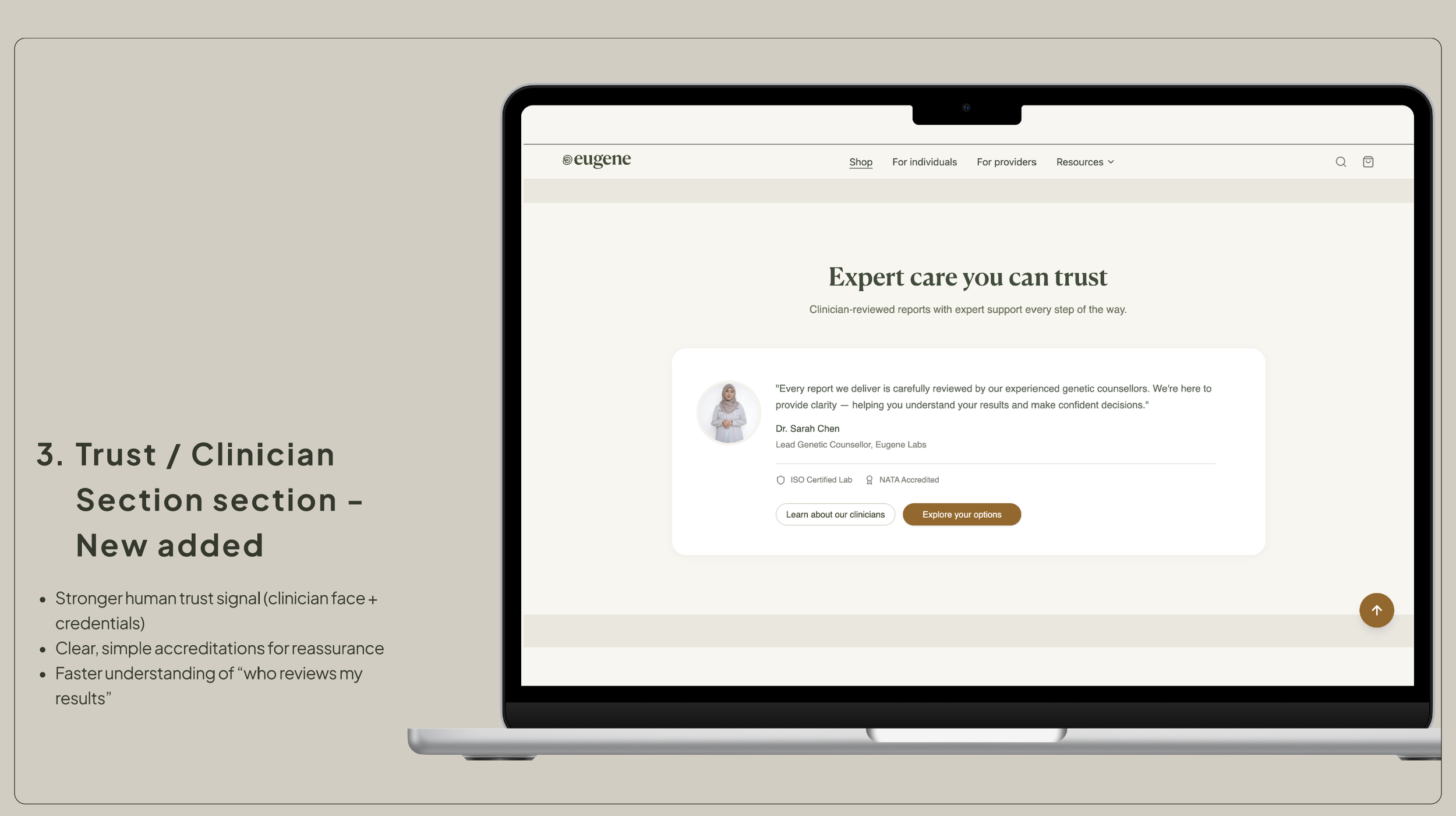
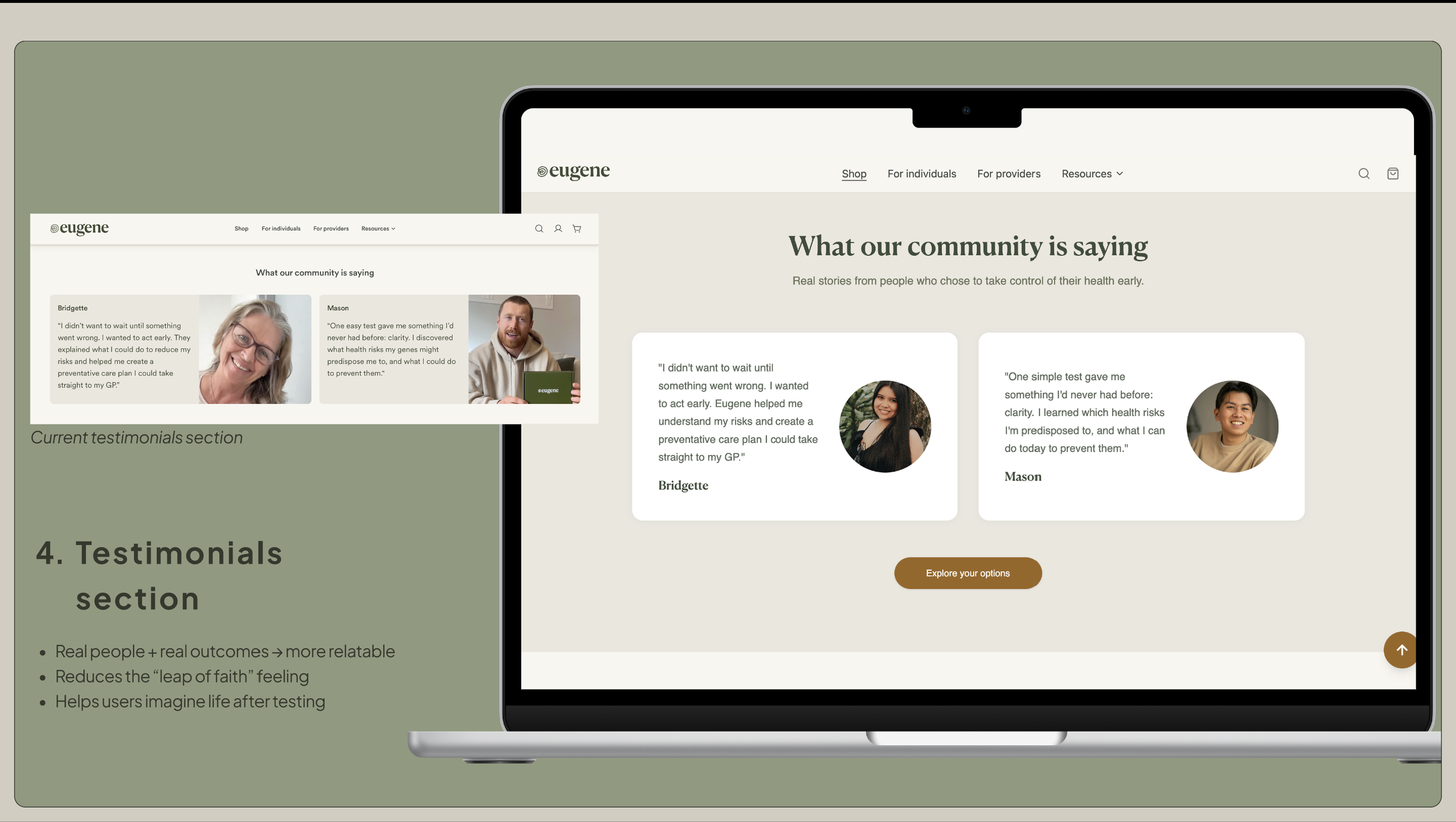
Trust & Reassurance Signals: Added testimonials, transparent explanations of the health-testing process, and credibility cues — helping users feel safe and confident.
More Inviting Visual Tone: From cold and clinical → to warmer, human-centred, approachable design — more inviting for users dealing with sensitive health topics.
Clear & Confident CTAs: Redesign of calls-to-action to be more action-oriented and user-friendly — guiding users toward next steps with less hesitation.
Role & Scope
As Product & UX/UI Designer, I handled:
UX analysis & content review of the original page
Competitor benchmarking and inspiration gathering
Information architecture redesign and content flow restructuring
Creation of a clearer value proposition and messaging strategy
UI design — high-fidelity layout for web
Implementation of trust elements (testimonials, credibility cues)
CTA redesign for clarity and stronger user engagement
Challenges & Learnings
Tone balancing: Translating medical and preventative health content into friendly, clear language without diluting seriousness.
Empathy vs credibility: Ensuring the page felt approachable yet authoritative — health topics demand both warmth and trust.
Self-driven constraints: As this was an independent redesign challenge, I had to anticipate diverse user perspectives without direct user testing — reinforcing the importance of clear IA, strong messaging, and trust elements.
Design sensitivity: Working with health content requires a careful and respectful visual and emotional approach — especially around fear, privacy, and clarity.
Final Deliverables